


Do you ever upload a photo to Instagram — proud of how it looks — but then it shows up crooked, cut off, or blurry on your feed?
You’re not alone. Many creators and small businesses struggle with that. In 2025–2026, Instagram keeps changing how it displays images and videos: feed size, grid view, story format — everything. If you don’t keep up, you risk:
- Weird cropping that chops off important parts of your photo or video
- Blurry or pixelated content
- Inconsistent feed appearance that looks unprofessional
- Lower engagement because visuals don’t catch eyes
But here’s the good news: using the right post sizes makes your account look sharp, polished, and trustworthy. When your photos and videos display correctly, people trust your brand more — and are more likely to like, comment, share, or follow.
In this guide, you’ll learn exact sizes, aspect ratios, and simple best practices for every kind of Instagram content — posts, carousels, stories, reels, profile pics, and ads. Even if you’re a total beginner, by the time you finish reading you’ll know exactly how to post like a pro.
Quick Reference: Instagram Post Sizes 2026 at a Glance
Here’s a handy table summarizing all recommended sizes depending on what you want to post:
Quick rule of thumb: Always design around 1080 px width (or 320 px for profile photos) and the height depends on the format. That way your posts stay sharp and crisp, no weird stretching or blurriness.
Key Terms Explanation:
Before diving deeper, let’s understand a few common terms so you’re never confused:
- Pixels (px): The tiny dots that make up your image. More pixels = sharper image (up to a point).
- Aspect Ratio: The shape of the photo — width compared to height (e.g. 1:1 means square, 9:16 means tall vertical).
- Square: Equal width and height (like a box).
- Portrait: Taller than wide — good for vertical view on phones.
- Landscape: Wider than tall — good for wide photos like landscapes or group pictures.
- Full-screen Vertical: Tall vertical format to fill phone screen height — used for stories and reels.
- Carousel: A post with multiple images/videos in one upload — all images follow the same size or get cropped/resized.
When to Use What — Tips By Post Type
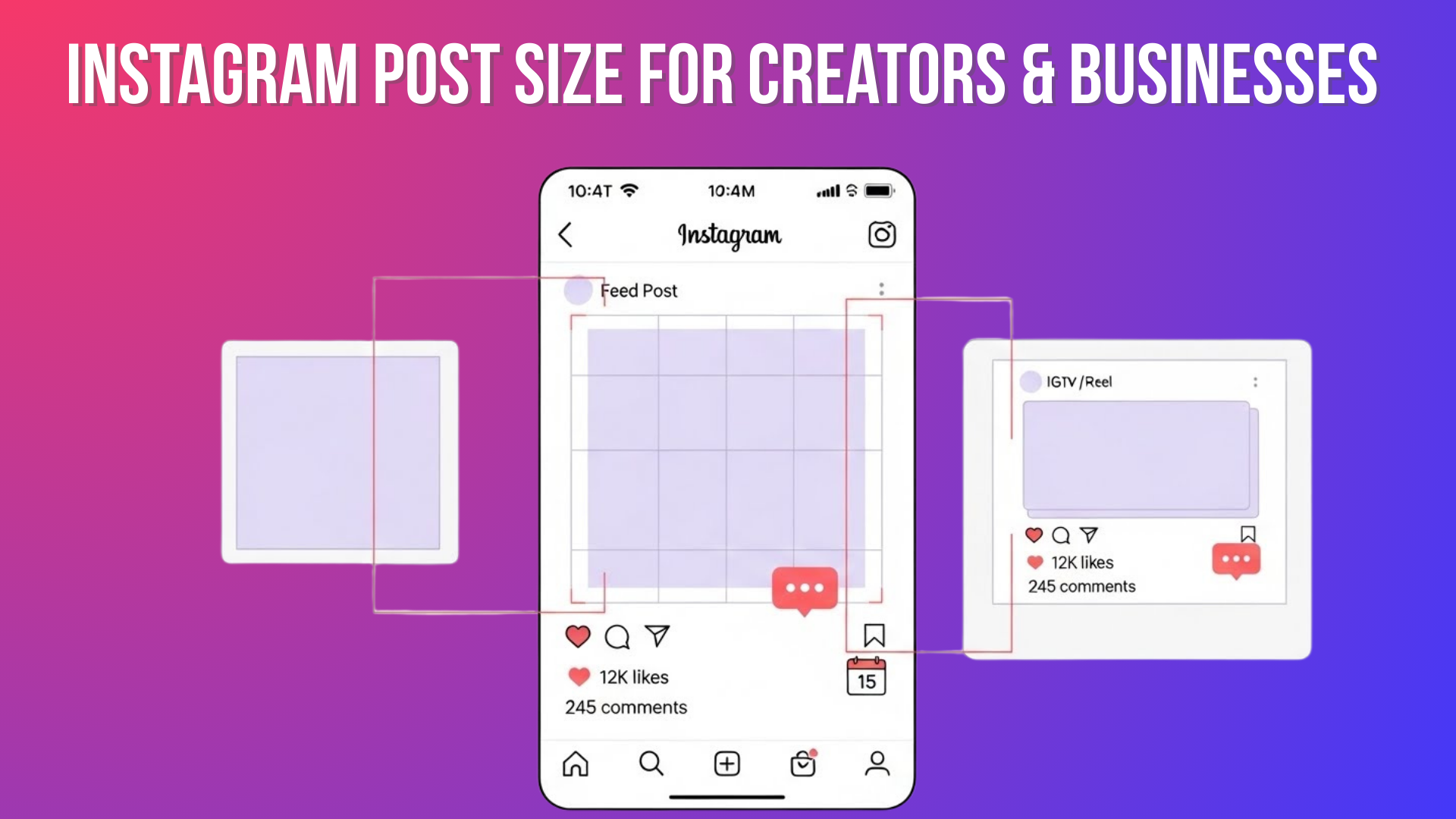
1. Feed Posts (Square, Portrait, Landscape)
- Square (1080 × 1080): Safe choice, always works. Use this when you want consistency — for example, if you post quotes, product photos, or a grid that looks clean.
- Portrait / Vertical (1080 × 1350): Great for catching attention. On mobile feed, vertical posts take up more screen space. This means they can stand out more than square or landscape posts. Good for portraits, fashion, full-body photos, or tall visuals.
- Landscape / Horizontal (1080 × 566): Best for wide visuals — scenic shots, wide group photos, panoramic views. But note: because height is small, details may feel compressed on mobile feed.
Pro tips:
- If you mix post types (square, portrait, landscape), your feed can look messy — pick one style if you want a clean aesthetic.
- For portrait or landscape, always keep the subject centered so important parts don’t get cropped when Instagram resizes.
- For maximum reach, many creators now favor portrait (vertical) because it “fills up” the screen more and grabs attention.
2. Carousel Posts (Multiple Images/Videos)
Carousels are powerful if you want to share multiple photos/videos at once — for example, step-by-step tutorials, before/after comparisons, or product shots.
- For consistency, set all slides to the same size/aspect ratio before uploading — ideally square (1080×1080) or portrait (1080×1350). Mixed sizes may cause Instagram to crop or add white spaces automatically.
- For portrait carousel posts, keep important elements (text, faces) in the center area, because the grid preview may crop a bit from the top or bottom.
- This makes your carousel clean, professional, and avoids surprise cropping.
3. Stories & Reels (Vertical Full-Screen)
Stories and Reels are vertical by nature. They show full-screen on phones — ideal for immersive content and a mobile-first audience.
- Use 1080 × 1920 pixels (aspect 9:16). This fills the screen vertically and avoids black bars or cropping.
- Keep essential content — text, logos, faces — toward the center. Avoid placing anything important too close to the very top or bottom, because interface elements (like “reply,” “next story,” etc.) could cover them. Many templates suggest leaving ~250-300 px margin from edges.
When posting a Reel with a cover thumbnail:
- Use the same 1080 × 1920 size for the cover image.
- Center the main subject so it shows nicely both in feed preview and in full-screen view.
Why Correct Instagram Sizes Impact Your Brand & Growth
Using the right sizes is not just about looking pretty. It affects how people perceive your brand and interact with your content. Here are concrete benefits:
- Clarity & Quality: Instagram compresses and crops wrong-sized images — proper dimensions keep photos sharp and visible.
- Better Engagement: On mobile, vertical and well-sized posts stand out more — more likely to catch attention and get likes or shares.
- Professional Image: Consistent sizing builds brand trust and makes your profile look polished, not messy.
- Ad & Algorithm Friendly: Instagram’s ad system and algorithm favor content that meets technical specs — correct size ensures your ads get approved and feed posts show correctly.
- Less Work Later: When you design once at the correct size, you avoid re-editing, resizing, or redoing posts later if they get cropped badly.
How to Prepare Instagram-Ready Images & Videos (Step-By-Step)
Here’s a simple workflow any beginner can follow — no fancy design skills needed.
- Choose Your Post Type / Format: Decide if it’s a feed post, story, reel, carousel, ad, etc.
- Set Up Canvas / Template: Use a tool like Canva, Photoshop, Lightroom, or any photo/video editor. Create a canvas with correct dimensions (e.g., 1080×1350 for portrait, 1080×1920 for stories).
- Place Your Subject / Text Carefully: Center main content (faces, text, logos), especially if it’s a portrait or vertical format. Leave margin/“safe zone” near edges.
- Export with Proper Settings
- Save images at 1080 px width (unless profile pic — then 320 px)
- Use an sRGB color profile to avoid color shifts
- Export JPEGs at good quality (e.g., 75–85% or “medium-high”) to balance quality + file size
- For videos/Reels: export at 1080×1920, MP4 or MOV, with a reasonable bitrate and frame rate to avoid oversized files.
- Preview Before Posting: Use Instagram’s preview or scheduling tools (like Canva or third-party planners) to check how the post will look in feed/grid view, story view, or as a thumbnail. Make adjustments if needed.
- Upload — Stay Consistent: Especially if you maintain brand aesthetic: use the same format (square/portrait) across posts or carousels for consistent style.
Common Mistakes to Avoid
1. Uploading Huge Images (like 3000 px wide) Expecting High Quality
Many beginners think bigger images mean better quality. However, Instagram automatically compresses any image wider than 1080 pixels, so extra pixels are wasted.
Always resize your images to 1080 px width before uploading. This keeps your visuals sharp without unnecessary compression.
2. Mixing Different Sizes Inside a Carousel
Carousels with images of different dimensions can confuse Instagram. The platform may crop your photos or add white borders, breaking the flow of your post.
Use the same size and aspect ratio for all slides in a carousel. This ensures a clean, professional look for multi-image posts.
3. Placing Key Text or Subjects Near Edges
Important elements like text, logos, or faces can get cut off by Instagram’s interface. This is especially common in Stories and Reels, where buttons like “Next Story” or swipe-up links cover the edges.
Keep all crucial content centered and leave a safe margin around the edges — particularly in Stories and Reels.
4. Uploading Low-Resolution Images (< 1080 px Width)
Some users upload small images thinking Instagram will automatically upscale them. This often leads to blurry or pixelated posts.
Always start with a high-quality source image and resize it to the recommended dimensions before uploading.
What’s New & What to Expect in 2026
While the core recommended sizes haven’t dramatically changed recently, here’s the trend and what to keep in mind:
- Vertical content (portrait, stories, reels) continues to get priority — more people browse IG on mobile. That means vertical/portrait posts likely keep performing better.
- Because vertical Reels and Stories dominate, many users plan content around 9:16 to fill full screen.
- For feed posts, portrait (4:5) posts remain a sweet spot for engagement — they take up more screen space than square or landscape.
- Always check for updates periodically — platforms often introduce slight changes to layout or supported sizes.
Pro Tips & Best Practices for Creators & Businesses
Choosing the right Instagram post sizes is key to making your content stand out. Following the correct Instagram image and video dimensions ensures your posts look sharp and professional.
- Build Templates: If you post often, make reusable templates in Canva or Photoshop for each format (post, story, reel). Saves time and keeps consistency.
- Maintain a “Safe Zone”: Especially for stories/reels — avoid placing text or important visuals near top/bottom.
- Stick to 1080 px Width: Don’t overcomplicate with super high-res — just design smartly and at the correct size.
- Preview Before Posting: Always double-check how your post looks on feed, grid, story, or reel preview.
- Consider Engagement Behavior: Use portrait for feed posts, vertical for stories/reels — because mobile users engage more with tall visuals.
- Use Good Quality Sources: Start with high-resolution originals; avoid screenshots or overly compressed files.
- Keep Visual Style Consistent: For brand identity — use the same fonts, colors, layout across posts.
Always stick to Instagram’s recommended post sizes and aspect ratios to maximize engagement and maintain a clean, professional feed. Properly sized content helps your brand appear polished and visually appealing.
Get the Blue Tick on Instagram
Conclusion
If you’ve ever felt frustrated by Instagram chopping off parts of your pictures or making your videos look blurry, you’re not alone. It’s painful when you pour effort into visuals — only to see them look messy after uploading.
But it doesn’t have to be that way. By using the sizes listed above, centering your content, and exporting images exactly at the right dimensions, you can make your feed look clean, professional, and inviting — even if you’re just starting out.
With a bit of care — a template here, a preview there — your photos and videos will display exactly how you envisioned them. Your brand will look polished, your audience will feel respected, and your engagement will likely go up.
So go ahead — design with confidence, post with clarity, and let your content shine on Instagram.
Frequently Asked Questions (FAQs)
Q1: Why 1080 px width — isn’t 4K or higher better?
A: Instagram automatically compresses and resizes images wider than 1080 px down to 1080 px. Uploading higher-resolution images doesn’t improve quality — it just wastes file size and might trigger heavier compression.
Q2: Can I use a 3:4 ratio instead of 4:5 or 1:1 for feed posts?
A: Some users and guides say 3:4 is supported — but to stay safe and avoid unpredictable cropping, best to stick with standard 4:5 (portrait), 1:1 (square), or 1.91:1 (landscape).
Q3: What if I upload an image with the wrong size — will Instagram fix it?
A: Instagram will try: it might crop, compress, or stretch. But often it leads to blurry images, cut-off edges, or awkward framing. That’s why pre-sizing is important.
Q4: Should I always use portrait (vertical) posts on feed?
A: It’s a strong option — portrait posts take up the most screen space and tend to get better attention on mobile. But square or landscape might be better for certain visuals (e.g., wide scenery, group photos). Use what fits the content best.
Q5: What size should I use for video Reels or Stories ads?
A: Always use 1080 × 1920 px (9:16) for full-screen vertical videos — it fills phone screens best and ensures a clean display.
Q6: What about the 4:5 aspect ratio for Stories?
A: The 4:5 aspect ratio is not ideal for Stories because Instagram Stories are vertical and designed for 9:16 full-screen display. Using 4:5 can leave borders and reduce visual impact.


