


Have you ever wondered why two websites with the same traffic can earn completely different ad revenues? One publisher makes only $3 RPM, while another earns $30 RPM — even though both have similar traffic and topics.
Surprising, right?
The truth is, it’s not always about your niche, ad network, or traffic volume — it’s about how you position your ads.
This concept is called Ad Layout Optimization, and it’s one of the most overlooked factors in website monetization. Many publishers unknowingly lose 30–60% of potential ad revenue simply because their ad placements aren’t optimized for visibility, engagement, and user experience (UX).
Think of it this way: if your ads sit in blind spots or interrupt the reading flow, users scroll past them. Less visibility → lower engagement → lower click-through rates → and ultimately, lower RPM.
But here’s the good news — with smart ad layout design, you can significantly boost your RPM without flooding your page with ads or frustrating your readers.
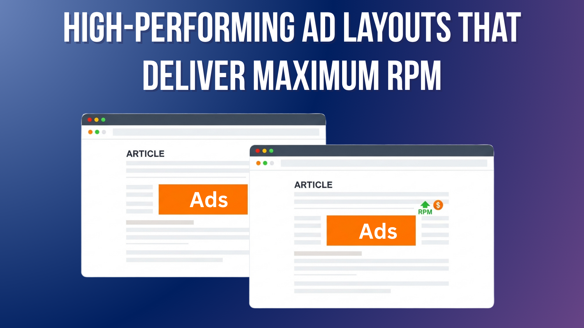
In this guide, we’ll explore 10 High-Performing Ad Layouts That Deliver Maximum RPM — layouts proven to increase ad viewability, engagement, and earnings across multiple publisher case studies. You’ll learn what each layout is, why it works, how to implement it, plus its pros, cons, and which types of websites benefit the most.
By the end, you’ll know exactly how to structure your ads for maximum revenue and a better user experience.
What Is RPM & Why Layout Matters
What is RPM?
“RPM” stands for Revenue Per Mille (per thousand impressions).
It tells you how much you earn per 1,000 pageviews, making it easier to compare pages or ad strategies.
Here’s the formula:
RPM = (Total Revenue ÷ Total Impressions) × 1,000
For example, if you earned $50 from 10,000 pageviews:
RPM = (50 ÷ 10,000) × 1,000 = $5
Understanding your RPM helps you track which pages, layouts, or ad types perform best — and where your optimization opportunities lie.
Why Ad Layout Matters?
You can have great traffic, fast hosting, and premium ad networks — but if your ads aren’t visible, you’ll earn less.
Multiple ad optimization studies show that placement, viewability, and user experience are the biggest factors influencing RPM.
In other words: Better layout = More visible ads = Higher RPM.
Even small layout tweaks — like shifting an ad lower into the content or using a sticky format — can lead to double-digit RPM gains.
10 High-Performing Ad Layouts That Deliver Maximum RPM
Below are the top-performing ad placements used by successful publishers in 2025. Each layout includes its purpose, psychology, setup tips, and data insights.
1. In-Content Rectangle Ads (300×250 px)
A medium rectangle ad (300×250 px) placed inside your article content, usually after the 2nd or 3rd paragraph.
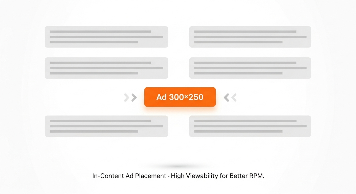

Why It Works
Readers are most attentive when they’re midway through a paragraph. This ad naturally appears in the flow of reading, not as a disruption.
A 2024 case study found that in-content rectangles increased RPM by up to 28% compared to sidebar ads, mainly due to higher visibility and contextual relevance.
How to Implement
- Place your first ad after the 2nd paragraph (not the first).
- Use lazy loading to improve Core Web Vitals.
- Maintain good spacing between text and ad.
Pros
✅ High viewability and engagement
✅ Blends with natural reading pattern
✅ Works across mobile and desktop
Cons
❌ Too many can disrupt UX
❌ Needs balanced spacing
Best For
Bloggers, content creators, and long-form publishers.
Pro Tip: Test placements after both the 2nd and 5th paragraphs — measure which delivers better RPM over a week.
2. Sticky Bottom Ad (Mobile-Friendly Layout)
A sticky ad bar that stays visible at the bottom of a mobile screen as users scroll.
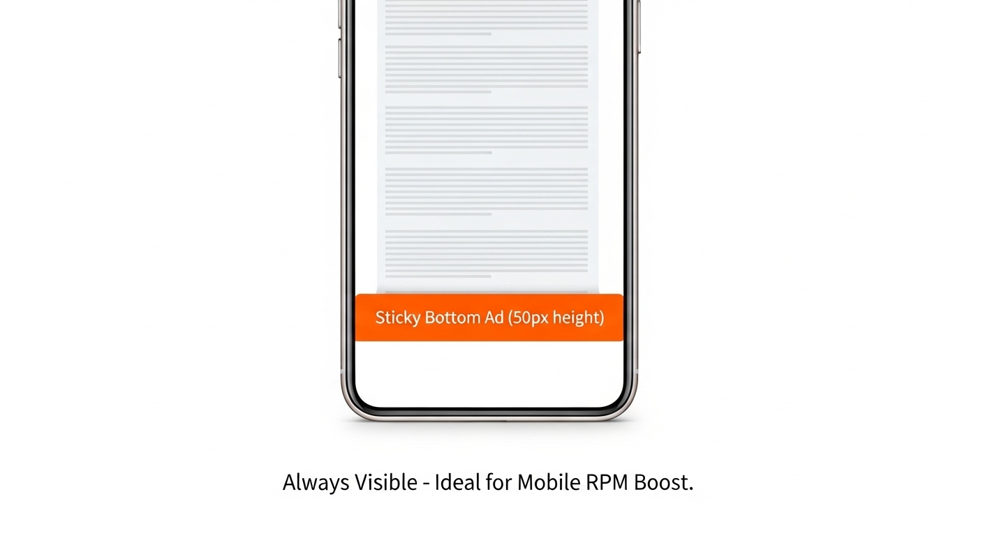
Why It Works
It sits perfectly in the thumb zone, where mobile users constantly look. Research shows sticky mobile ads achieve 90–95% viewability, compared to only 60–70% for static banners.
How to Implement
- Keep it compact (50–60 px height).
- Add a clear “Close (X)” button for compliance.
- Avoid covering navigation.
Pros
✅ High viewability
✅ Great for mobile-heavy sites
✅ Doesn’t affect content flow
Cons
❌ Intrusive if too tall
❌ Must comply with Google’s sticky ad rules
Best For: Mobile-first websites, blogs, and news portals.
Pro Tip: Combine this with in-content ads for a balanced and profitable mobile setup.
3. Sticky Sidebar Ad (Desktop Layout)
A sticky ad that stays visible in the sidebar while scrolling on desktop.
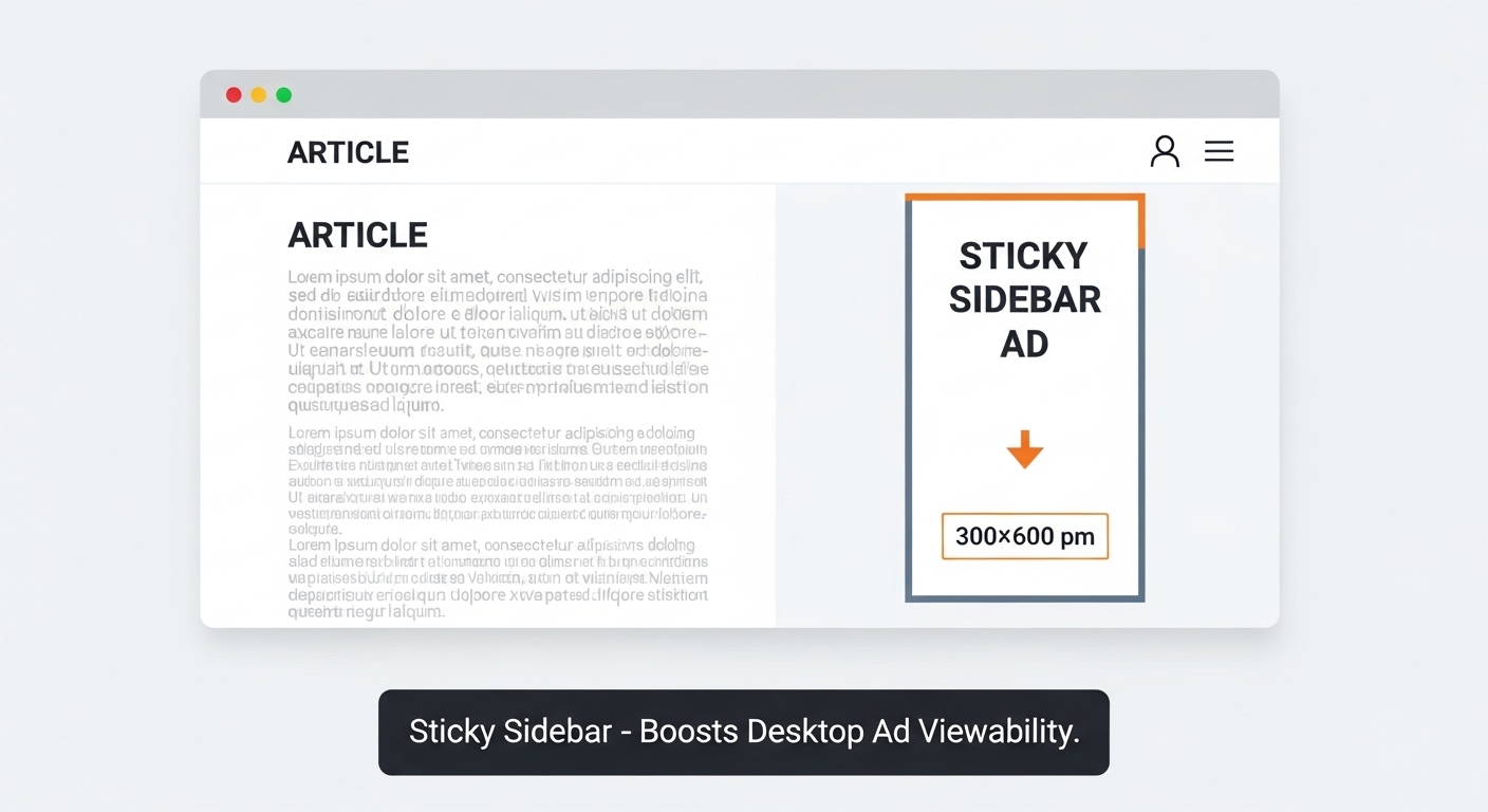
Why It Works
Desktop users have extra screen space. Keeping an ad in view boosts exposure and click chances. Studies suggest sticky sidebars can raise RPM by 15–25% compared to static ones.
How to Implement
- Use one 300×600 px half-page ad on the right.
- Apply CSS position: sticky.
- Keep adequate margins for readability.
Pros
✅ High visibility
✅ No interruption to content
✅ Great for branding ads
Cons
❌ Not for mobile
❌ Requires adherence to ad policy
Best For: Desktop-focused publishers, magazines, and professional sites.
Pro Tip: Use on long articles (1000+ pixels scroll depth) for best results.
4. Leaderboard Ad (728×90 px)
A wide banner placed at the top (below navigation) or the bottom of your page.
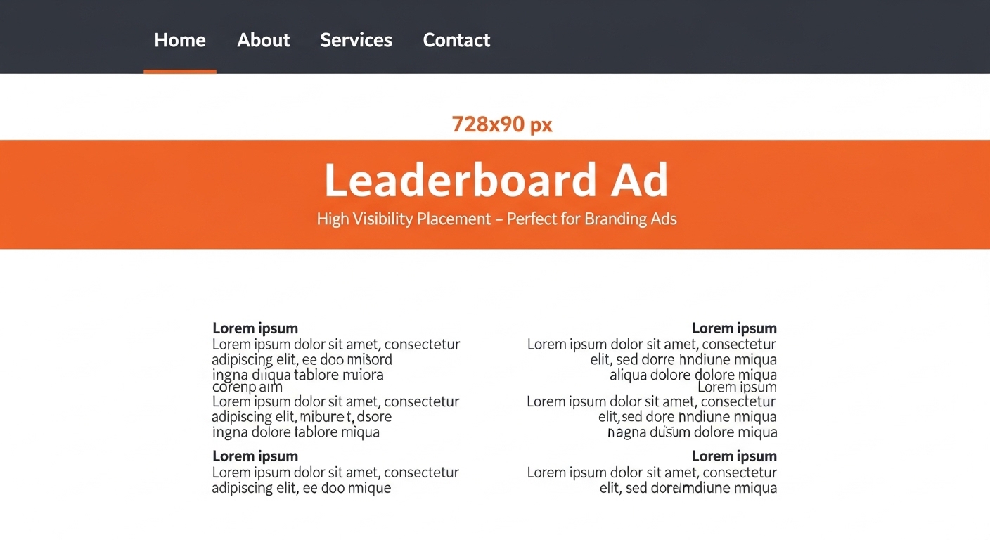
Why It Works
This ad is instantly visible and ideal for branding. While CTRs may be moderate, viewability often exceeds 80%, making it a premium placement.
How to Implement
- Place below the header, not above it.
- Make it responsive for tablets.
- Avoid stacking two leaderboards.
Pros
✅ High visibility
✅ Easy setup
✅ Great for brand campaigns
Cons
❌ Can cause layout shift if not optimized
❌ Lower CTR than in-content ads
Best For: Desktop and tablet layouts, news sites, and authority blogs.
Pro Tip: Use with sticky footer ads for a “top + bottom” visibility strategy.
5. Native In-Feed Ads
Ads that blend naturally within your content feed — like related posts or article suggestions.
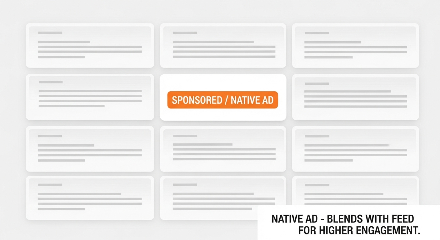
Why It Works
They leverage pattern interruption: users think they’re part of the content, increasing engagement.
Native ads often deliver 2–3x higher CTRs than standard banners.
How to Implement
- Match site fonts, colors, and layout.
- Clearly label “Sponsored” for transparency.
- Test headline and image ratios.
Pros
✅ Excellent UX
✅ High engagement
✅ Works on all devices
Cons
❌ Needs design effort
❌ Requires frequent testing
Best For: Social-style blogs, media portals, and recommendation feeds.
Pro Tip: Match ad categories with article topics to maintain contextual trust.
6. Above-the-Fold Billboard (970×250 px)
A large ad unit is displayed above the fold before users scroll.
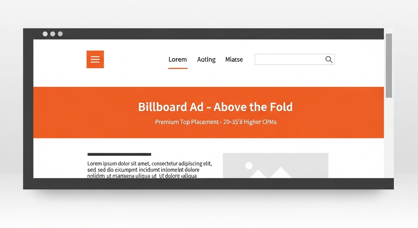
Why It Works
It captures immediate attention and often earns 20–35% higher CPMs from premium advertisers.
How to Implement
- Keep height under 250 px.
- Optimize load speed (lazy load if needed).
- Use minimal text and bold visuals.
Pros
✅ High visibility
✅ Strong CPM potential
✅ Excellent for homepage monetization
Cons
❌ Can reduce UX if oversized
❌ Slower load if unoptimized
Best For: Magazine homepages, publisher landing pages.
Pro Tip: Use only one billboard per page to avoid content pushdown.
7. In-Article Anchor Ad
A floating ad that scrolls within your article, attached between paragraphs.
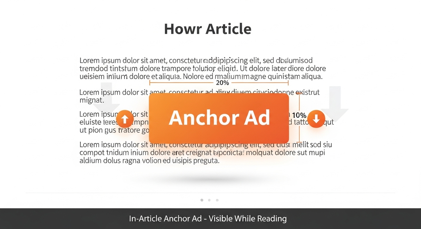
Why It Works
It remains visible throughout the reading journey, improving engagement by 20–30%.
How to Implement
- Use one per post.
- Place after the 3rd or 4th paragraph.
- Maintain clear padding.
Pros
✅ Great visibility
✅ Smooth reading experience
✅ Consistent CTRs
Cons
❌ Not ideal for short posts
❌ Needs proper spacing
Best For: Long-form content and tutorials.
Pro Tip: Combine with one sticky ad for top RPM lift.
8. Content Recommendation Widget (End-of-Post Ads)
Ads shown below your article, usually labeled “Recommended for you.”
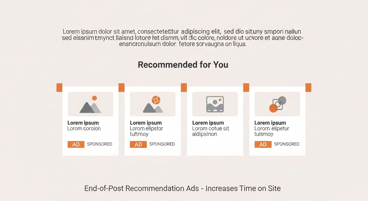
Why It Works
After reading, users are in explore mode. These placements can extend session duration and boost RPM by 15–20%.
How to Implement
- Use native ad widgets.
- Mix internal + external content.
- Avoid overloading external links.
Pros
✅ Keeps users engaged
✅ Boosts time-on-site
✅ Natural placement
Cons
❌ Needs content volume
❌ Widget-heavy setups can slow page speed
Best For: Blogs, publishers, and news websites.
Pro Tip: Use this spot to also promote your own top posts.
9. Multiplex (Grid-Based Layouts)
A grid of multiple small ads mimicking related posts (e.g., 2×2 or 3×2).
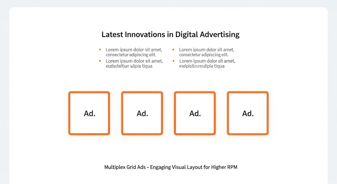
Why It Works
Uses choice psychology — users are more likely to click when offered multiple visual options.
These can raise RPM by up to 40% when placed below the content.
How to Implement
- Use even spacing and alignment.
- Blend with your site design.
- Limit to one grid per page.
Pros
✅ Visually engaging
✅ High interaction potential
✅ Great for image-heavy sites
Cons
❌ Can look cluttered
❌ Needs fast-loading scripts
Best For: High-traffic or entertainment blogs.
Pro Tip: Balance internal and external ads to retain readers.
10. Mid-Content Video Ads (Auto-Play Muted)
Short, muted video ads embedded mid-article.
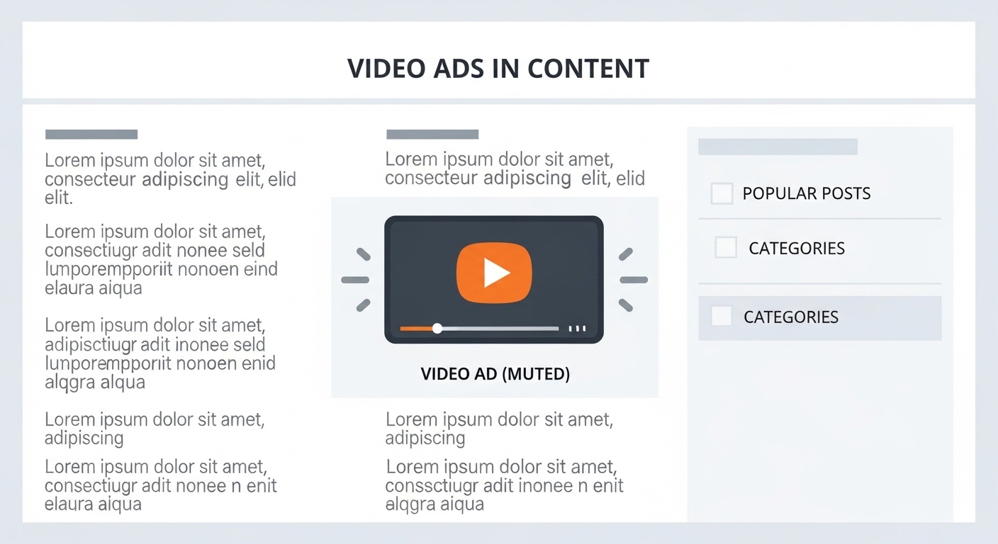
Why It Works
Video attracts 3–5x more engagement than image-based ads. Autoplay (muted) ensures impressions without interrupting reading.
How to Implement
- One per long article.
- Keep autoplay muted.
- Lazy-load for performance.
Pros
✅ High engagement
✅ Attracts premium advertisers
✅ Great for multimedia sites
Cons
❌ Can slow load
❌ Needs careful optimization
Best For: News, lifestyle, and multimedia blogs.
Pro Tip: Pair with sticky ads for strong RPM synergy.
Comparison Table: Top Layouts by RPM & Use Case
| Ad Layout | Avg. RPM Boost | Best For | Device Type | UX Rating |
| In-Content Rectangle | +28% | Blog posts | All | ⭐⭐⭐⭐ |
| Sticky Bottom | +35% | Mobile users | Mobile | ⭐⭐⭐⭐⭐ |
| Sticky Sidebar | +20% | Long-form content | Desktop | ⭐⭐⭐⭐ |
| Leaderboard | +15% | Homepage | Desktop | ⭐⭐⭐ |
| Native In-Feed | +25% | Social/blogs | All | ⭐⭐⭐⭐⭐ |
| Billboard | +30% | Homepages | Desktop | ⭐⭐⭐ |
| Anchor Ad | +22% | Long articles | All | ⭐⭐⭐⭐ |
| Content Widget | +18% | Publishers | All | ⭐⭐⭐⭐ |
| Multiplex Grid | +40% | High-traffic sites | All | ⭐⭐⭐ |
| Video Ad | +50% | Multimedia | All | ⭐⭐⭐⭐ |
How to Choose the Right Layout for Your Site
Choosing the right ad layout isn’t just about adding banners randomly — it’s about matching the placement to your audience behavior, device type, and content format. Smart ad layout optimization helps you unlock higher RPM and consistent revenue growth without compromising user experience.
1. Device Mix
Your audience’s device type heavily influences which ad placements perform best.
- For mobile traffic: Focus on Sticky Bottom Ads and In-Content Rectangles. Mobile users scroll quickly, and these placements stay within their natural thumb zone, ensuring higher visibility and engagement. Studies show sticky bottom ads can deliver up to 35% more RPM than static banners.
- For desktop traffic: Use Sticky Sidebar Ads and Leaderboard Banners. Desktop visitors spend longer on pages, so persistent side or top placements work well. These high-earning ad layouts help maximize viewability on large screens.
2. Content Type
The type and length of your content also decide which ad formats bring the most value.
- Long-form content: Use In-Content Ads paired with Anchor Ads. These integrate naturally into articles and keep ads visible while readers scroll. For example, a blog post over 1,000 words can support two well-spaced in-content units for an RPM boost of up to 25–30%.
- Short-form content: Try Above-the-Fold Billboards or Native In-Feed Ads. Shorter posts need quick engagement before users scroll away, so visible and native designs perform best.
3. User Experience (UX)
Even the best ad layout fails if it ruins the reading flow. Maintain proper padding between text and ads, and avoid placing ads too close to navigation menus or buttons. A clutter-free layout not only improves user trust but also boosts Core Web Vitals like Largest Contentful Paint (LCP) — a key factor in SEO and ad visibility. Fast-loading, responsive ad layouts tend to outperform slow, intrusive ones.
4. Viewability
Viewability means how much of your ad is actually seen by visitors. High viewability directly translates to higher click-through rates (CTR) and RPM. Track metrics like average scroll depth and time in viewport to identify which placements hold attention longer. For example, In-Article Anchor Ads often achieve 20–30% higher viewability than standard mid-content placements.
5. Traffic Source
Not all traffic behaves the same.
- Social visitors (from Facebook, X, or Pinterest) scroll fast, so Native In-Feed Ads and Sticky Bottom Ads perform better.
- Organic visitors (from Google Search) spend more time reading — perfect for In-Content Ads or Multiplex Grids that keep them engaged while monetizing effectively.
Understanding your traffic mix helps fine-tune your ad layout optimization strategy for maximum RPM gains.
Best Practices & Optimization Tips
If you want your ads to perform at their best, you need more than just good placements — you need smart optimization habits. Small tweaks can lead to big revenue jumps. Here are a few tried-and-tested practices that help you get the most from your high-performing ad layouts.
1. A/B Test Regularly
Every website and audience is different. What works on one site may not perform well on another. That’s why A/B testing (also called split testing) is your best friend.
Start by testing one change at a time — for example, move your in-content ad slightly lower or replace a leaderboard with a sticky sidebar. Then, track the difference in RPM for a week.
Even small layout adjustments can lead to 10–25% revenue increases when done strategically.
2. Prioritize Core Web Vitals
Google rewards websites that load fast and provide a smooth browsing experience. Slow-loading ads reduce your viewability, which means fewer impressions and lower RPM.
Optimize your Core Web Vitals — especially metrics like Largest Contentful Paint (LCP) and Cumulative Layout Shift (CLS). Use lazy loading, compress images, and avoid heavy scripts from unreliable ad partners. A faster site = happier users + higher earnings.
3. Use Responsive Ad Units
Your visitors come from all kinds of devices — phones, tablets, and desktops. A responsive ad automatically adjusts its size and layout to fit the screen perfectly.
Non-responsive ads can break your design or become invisible on mobile, hurting both user experience and ad performance. Using responsive display ads ensures your layouts always look professional and deliver maximum visibility.
4. Don’t Overload Above the Fold
The space “above the fold” (the part visible before scrolling) is valuable — but overstuffing it with ads can backfire. Users may feel overwhelmed and leave your site too soon.
Instead, focus on a clean layout that highlights both your content and ads. One well-placed leaderboard or billboard ad here is better than three crowded banners.
5. Track Page and Session RPM
Many publishers only look at Page RPM, but it doesn’t show the full picture. Session RPM tells you how much you earn per visitor session, which includes all the pages they view.
Sometimes, reducing ad clutter can lower Page RPM slightly but increase Session RPM because users stay longer. The goal isn’t just more clicks — it’s better monetization over time.
Common Mistakes to Avoid
Even experienced publishers make mistakes that quietly kill their ad revenue. If your RPM isn’t growing, these could be the reasons:
1. Overcrowding Pages with Ads
Adding too many ads doesn’t mean you’ll earn more. In fact, overcrowding can overwhelm your readers, slow down your page, and reduce ad viewability. Always prioritize balance — let your content breathe.
2. Using Desktop Ads on Mobile
Desktop ad units like sidebars don’t work well on mobile screens. They either disappear or overlap your content, frustrating users. Always choose mobile-optimized ad layouts like sticky bottom rails or in-feed ads for smaller screens.
3. Ignoring Layout Testing
If you’ve been using the same ad layout for months without testing, you might be losing revenue without realizing it. Regularly test new formats, placements, and ad densities. Even seasonal traffic changes can affect performance, so continuous testing keeps you ahead.
4. Blocking Navigation or Text
Ads that cover menu bars, buttons, or important text create a poor user experience and may even violate Google’s ad policies. Make sure every ad placement leaves enough padding and never interrupts key actions on your site.
5. Using Slow-Loading Widgets or External Scripts
Many third-party widgets promise better ads but can actually harm your site speed. Slow load times reduce viewability and increase bounce rates. Stick with lightweight ad partners and test your page speed regularly with tools like PageSpeed Insights or GTmetrix.
Conclusion:
If you’ve been driving traffic but still seeing low earnings, you’re not alone.
The biggest RPM boost rarely comes from ad networks; it comes from layout intelligence.
You already have valuable traffic — now it’s time to make your layout work for you.
Start small and build gradually. Begin by adding just one in-content ad after the second paragraph of your article. This placement blends naturally with the reading flow and helps you measure engagement without disrupting user experience.
Next, test a sticky bottom rail on mobile — it’s one of the highest-viewability placements and often delivers quick RPM gains. Keep it minimal, ensure it doesn’t block navigation, and monitor user interaction closely.
Track your results for at least a week before making adjustments. Each layout you test and optimize reveals new insights about your audience’s behavior and brings you one step closer to unlocking the true earning potential of your website.
Your traffic has value. The right layout unlocks it. The best time to optimize was yesterday. The next best time is today. Keep your readers first, your layout balanced, and your testing consistent — and you’ll see your RPM rise naturally, backed by data, not luck.
FAQs
Q1: What is a good RPM for a website?
It depends on your niche and traffic quality. Most sites see $3–$20 RPM, but optimized layouts can reach $30+ for the same traffic.
Q2: How many ad units should I place?
Start with 2–3 strategic placements — quality over quantity.
Q3: Do above-the-fold ads always perform best?
Not always. The best-performing spots are those that are viewed longest, not necessarily first.
Q4: Should I optimize for Page or Session RPM?
Use both. Page RPM shows performance per page, while Session RPM measures total visitor value.
Q5: Which ad sizes perform best?
Standard sizes like 300×250, 336×280, 300×600, and 728×90 attract the most advertiser demand


